
Schmincke's 40 supergranulating watercolours are ideal for depicting natural, structured, rough surfaces and textures and are therefore perfect for use in landscape painting.
Artist Jowita Marczuk shows how she makes use of the particularly granulating effects and combines the colours with non-granulating colours from the Schmincke HORADAM® AQUARELL watercolour assortment.
What You Will Need:
- Colours: HORADAM® AQUARELL - 981 Tundra Orange, 941 Forest Olive, 661 Burnt Sienna, 487 Cobalt Blue Light, 660 Raw Sienna
- Paper: Watercolour block, 100% cotton, cold pressed, e.g. Hahnemühle or Fabriano Artistico
- Brushes: Round brushes, size 12 and 6, e.g. da Vinci or Escoda and a small detail brush, e.g. da Vinci
- Other: palette, water container, paper tissues or kitchen roll, scratch paper
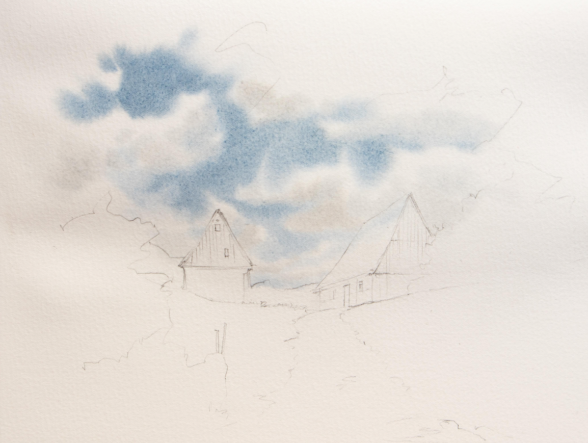
Step 1
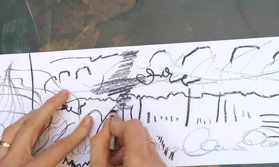
First of all, I sketch out the elements of the Painting. I pay attention to the correct perspective of the two buildings. I only vaguely hint at organic elements such as trees and bushes and determine the composition without attaching importance to details. The path narrows towards the horizon.

Step 2
Next, I wet the paper several times with clear water in the area of the sky. It is important to wet it evenly so that you have enough time to paint the sky. Then I start to paint the sky blue with a mixture of cobalt blue light and some burnt Sienna and a large round brush. By adding Sienna, the blue is toned down a little and is no longer quite bright.
I leave out the clouds when painting the sky. Towards the horizon, the clouds should become narrower and smaller because of the perspective effect. The sky is darker and more saturated directly above the viewer, i.e. at the upper edge of the painting, than at the horizon.

Step 3
To make the clouds look three-dimensional, I paint delicate shadows with a very transparent grey mixture of cobalt blue light burnt Sienna. I make sure that the paper is still wet so that the transitions are nice and soft.
Hint: Cobalt blue light and burnt Sienna make a beautiful and lively grey. If both colours are present in equal parts, the grey is rather neutral. If cobalt blue light predominates, it becomes a cool grey and with a little more burnt Sienna you get a warm grey. For the cloud shadows I used a rather warmer grey.
Step 4
Now I strengthen the shadows in some placeswith a more pigmented grey mixture and then smudge the transitions with a semi-dry and clean brush. Therefore, I wash the brush in clean water and dry it on a tissue. I repeat this every time before touching the paper with the brush. This prevents the absorbed pigments from being dispersed.
Hint: If the paper is already starting to dry, let it dry completely and carefully moisten the surface again to continue painting. This way you avoid uncontrolled running of the colour.

Step 5
Next I wet the paper in the lower area, the foreground. I start with a transparent mixture of forest olive, tundra orange and raw Sienna and lots of water to give the meadow its basic tone. I vary the mixture, sometimes it contains more forest olive and sometimes more raw Sienna.
Towards the front, the application should contain more colour, i.e. be more saturated. The path is indicated with tundra orange, the granulating quality of the colour produces texture. Here, too, the application is more colour-intensive towards the front.

Step 6
While the colours are still wet, I hint at shadows in the front area by applying a saturated mixture of forest olive, some burnt Sienna and cobalt blue light. Sprinkles of water add some variation to the application and make it more exciting. Therefore, I clean the brush and tap it on a finger over the paper.
I start painting the trees in the middle ground with a mixture of forest olive and raw Sienna. I hold the brush horizontally to the paper, it should not be too wet so that the application is interrupted here and there. If necessary, test the correct water content of the brush on a test sheet.

Step 7
With a saturated dark green of forest olive, burnt Sienna and cobalt blue light I hint shadows in the woods. I do not paint a straight line atthe lower edge, but suggest grass by painting over the lighter foreground with the dark green mixture and imitating blades of grass. Then I let everything dry.

Step 8
I moisten the left area in the foreground again and paint the bush with a mixture of forest olive and raw Sienna. Again I hold the brush horizontally to the paper and increase the pressure here and there to let flow more or less colour. I pull the colour on the left side into the dry area to get harder edges.
For the darker areas I use again the dark green from forest olive, burnt Sienna and cobalt blue light. The hills at the horizon are then indicated with a mixture of forest olive and cobalt blue light, it is enough to show them as a simple surface, so they move even more into the background.

Step 9
The two buildings in the painting now get their base colour. Therefore, I use a transparent mixture of cobalt blue light and burnt Sienna. To indicate shadows on the gable side and below the roof overhang of the right building, I strengthen the mixture a little.

Step 10
The transition between the meadow and the path is now reinforced a little. Along the edge I apply a green mixture of forest olive and raw Sienna. Towards the path I leave the edge, towards the meadow I smudge it with a semi-dry brush. In the foreground, the meadow and path are darkened again to suggest shadows and to strengthen the perspective effect. I use a mixture of forest olive, burnt Sienna and a little cobalt blue light for the meadow, and tundra orange, burnt Sienna and cobalt blue light for the path.
In the foreground I hint at individual blades of grass here and there. The further away from the viewer, the less detailed the elements become, so towards the horizon the grass is only indicated with horizontal lines.

Step 11
To make the bushes look a little more natural, I add individual branches and twigs. I make sure that they taper off thinly towards the top. This works best with a striping brush.

Step 12
On the building to the right, I add drawing elements to the ridge and eaves and hint at window and door openings with the grey mixture of cobalt blue light and burnt Sienna. In doing so, I avoid painting doors and windows as closed rectangles, but leave one side "open", which looks looser and more interesting.
I hint at the wooden façade in some places with vertical strokes. I am not too precise here, sometimes the strokes are shorter, sometimes a little longer. For highlights on tree trunks I loosen the pigments with a flat, clean brush and dab them with a paper tissue.

Step 13
I work out the details on the buildings a little more. The application should now contain little water and a lot of colour. In the foreground I also strengthen the textures. With a half-dry brush and a brown mixture of burnt Sienna and cobalt blue light, I stroke the surface of the paper, holding the brush horizontally. Due to the textured surface of the paper, this creates an openwork application that imitates texture.
I then sprinkle a dark brown black mixture of burnt Sienna and cobalt blue light (in roughly equal parts) onto the path to suggest pebbles and stones. On the meadow I add some stalks; in the front I paint individual stalks, towards the horizon the structures in the meadow are shown more as horizontal lines.
Hint: To create an effect of depth, areas in the foreground are worked out more detailed than areas in the background.

Step 14
The last element to be painted is the treetop that juts into the painting. Therefore, I use forest olive, some burnt Sienna and cobalt blue light for the light tones and add more burnt Sienna and cobalt blue light for the shadows. Speckles indicate individual leaves.

Step 15
Last but not least, the tree in the foreground gets a trunk and some branches. I paint these with a very dark and intense black mixture of burnt Sienna and cobalt blue light.
The painting is now finished!

About the Artist:
Jowita Marczuk lives and works in Baden-Wurttemberg/ Germany. Whether drawing or painting - creativity has accompanied her all her life. In 2018, she came to watercolour painting in a round about way - via urban sketching. Since then, she has been sharing her passion with people from all over the world on her Instagram channel - @jowishka.art
Thank you to our friends at H. Schmincke & Co. and artist Jowita Maczuk for this great how-to!

Recent Articles

May 02, 2024
Choosing Your Opus Watercolour Brushes

April 29, 2024
Copic Award 2024
April 28, 2024
Mother’s Day Card Tutorial Using Dual Brush Pens
April 26, 2024
How To Be An Artist In The World with Wendy Welch
April 18, 2024
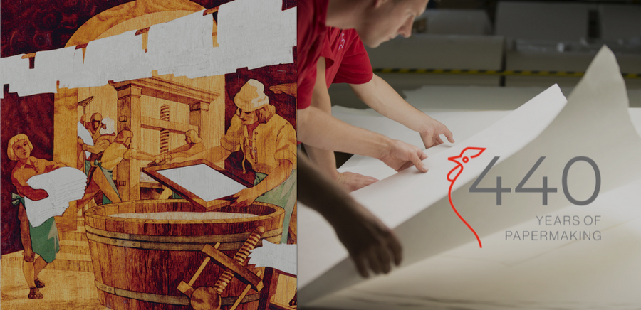
Hahnemühle Celebrates 440 Years
April 15, 2024
Blossoming As An Artist with Sandy Terry

April 12, 2024
The Opus Warehouse Sale 2024
April 05, 2024
Revival of Colour with Opus Essentials Spring Colours

April 02, 2024
How To Refill COPIC Markers

April 01, 2024
Liquitex: Just Imagine 2024
April 01, 2024
AFK - ArtReach: Drawing What We Hear (grades 4–7)
March 28, 2024
Art Events: Art Vancouver 2024
March 23, 2024
An Exploration Update with Cara Bain
March 20, 2024