
As with any process, knowing what your resources are is one of the biggest assets to getting the results you want. Getting the colours you’re after in oil painting is no exception, and while we are talking specifically about oils, much of this article can be applied to other mediums including acrylic, watercolours, and more.

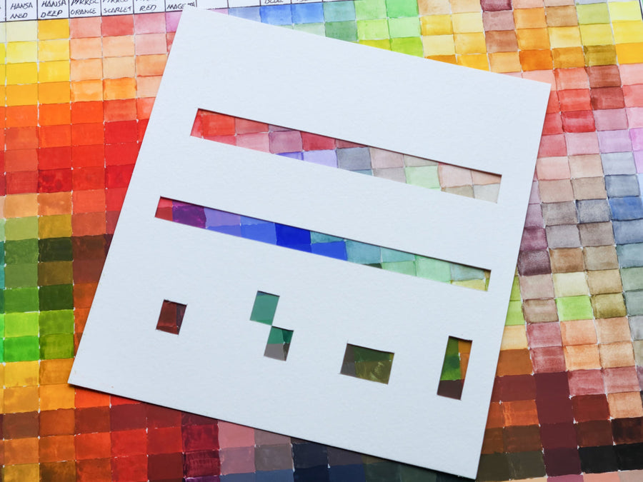
One of the most useful tools you can create for yourself (and your studio) is a colour chart of all of the colours you currently have in your collection. This allows you to see what you have in your colour palette AND to see where you may need to put some focus if you notice you encounter problems getting the colour you want.
Start by gathering your supplies. Pull together all of the paints you’re wanting to test in the chart, and a surface you’d like to make your chart on. We recommend using oil paper such as the NEW Stonehenge Oil Paper, as it’s relatively inexpensive, and easy to pin up on your bulletin board to use as a reference. If you like crisp grid lines, you may also want to use some narrow masking tape.
Make a grid on your paper, marking it off with either pencil or permanent marker, or creating a grid with narrow masking tape.
In our example, we’re going to be looking at a selection of blues, a popular colour range, and one most people have a few different kinds of in their paintbox.
Across the top of your grid, fill a grid cell with a single colour at full strength. We’re starting with Cobalt Blue. This will give you a look at what the first colour looks like straight out of the tube.
In the cell below, add a mixture of the Cobalt Blue with a small quantity of Titanium White, say in a ratio of approximately 75% full strength colour with 25% Titanium White. Paint the resulting colour in the cell below the full strength colour.
Next, create a that is approximately 50% Cobalt Blue/50% Titanium White to create a lighter mix. Then make a mix of 25% Cobalt Blue with 75% Titanium White. For the final colour create a very pale version that begins with a small amount of Titanium White, and add just a tiny touch of Cobalt Blue to it. Titanium White has a very high opacity, and can create very light colours quickly, so be aware of that as you are creating your mixes.

Once you’ve finished creating the range of values for your first colour, continue with the other colours until you have completed your chart.
When charting out all of your colours as a reference, you may find it helpful to group the colours by colour family so you can easily compare the reds, yellows or blues to one another within that colour range. If this is the method you’ll be using, consider using standard size pages of oil paper such as the Arches Oil Paper pad that will fit into a protective folder like the Itoya Evolution Profolio once it’s dry. Whether your collection of paints is large or small, you will find the chart(s) you make in this way are a very useful resource for choosing colours for future projects.
Recent Articles
April 18, 2024
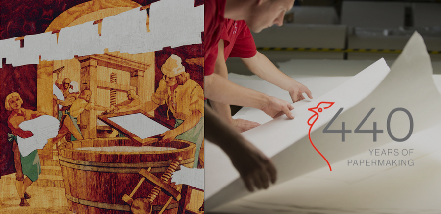
Hahnemühle Celebrates 440 Years
April 15, 2024
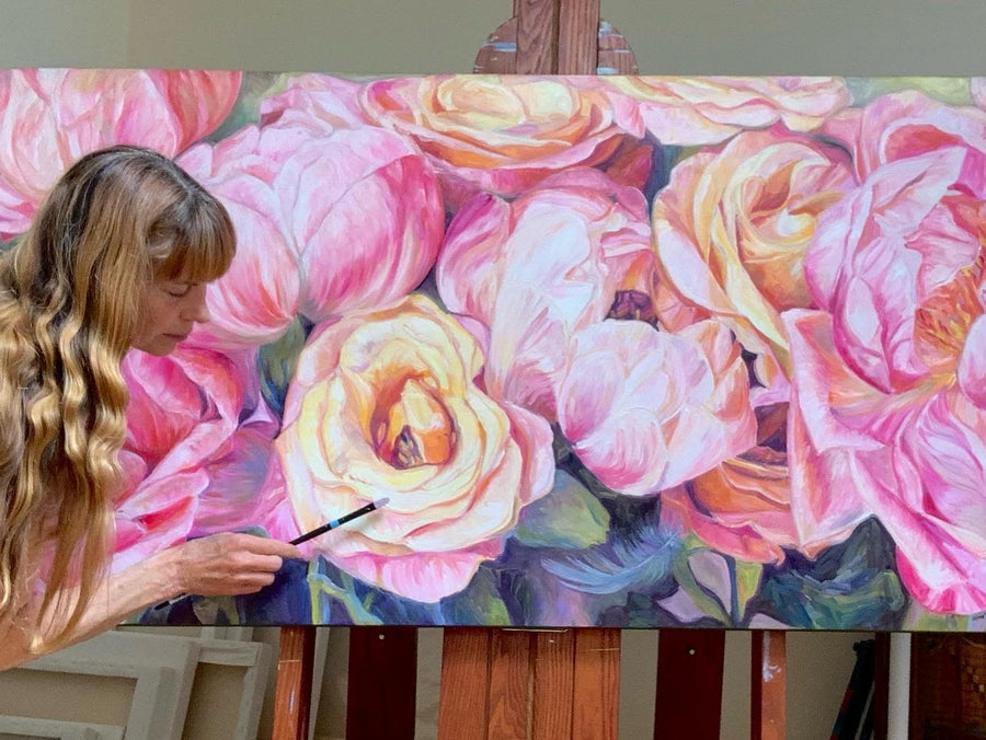
Blossoming As An Artist with Sandy Terry

April 12, 2024
The Opus Warehouse Sale 2024

April 05, 2024
Revival of Colour with Opus Essentials Spring Colours
April 02, 2024
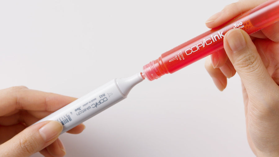
How To Refill COPIC Markers

April 01, 2024
Liquitex: Just Imagine 2024

March 28, 2024
Art Events: Art Vancouver 2024
March 23, 2024
An Exploration Update with Cara Bain
March 20, 2024
How To Make A Mixing Chart with Daniel Smith Gouache
March 19, 2024
Learn to Draw Like Beya Rebai with Neocolor II

March 13, 2024
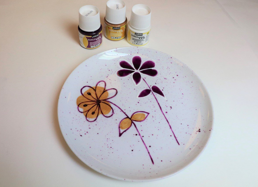
Customize Your Leather Trainers with Floral Motifs
March 13, 2024
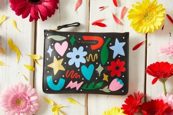
Customize Your Own Leather Pouch
March 13, 2024