Our theme "Nature's Splendour" is our self-reminder that art, like spring, is a force of renewal.
As spring awakens, the world shifts—soft light stretching across longer days, colour bursting back into view. It’s a season of renewal—time to breathe deep, step outside, and create.
Nature’s Splendour is our invitation to explore that dialogue—to capture the pulse of the season in every sketch, wash, and mark.
Whether you’re framing your latest work, preparing for an art market, or balancing light and dark in your colour palette, Nature’s Splendour is a reminder that art, like spring, is a force of renewal.
Painting Layers, Lines & Tape with Meghan Hildebrand
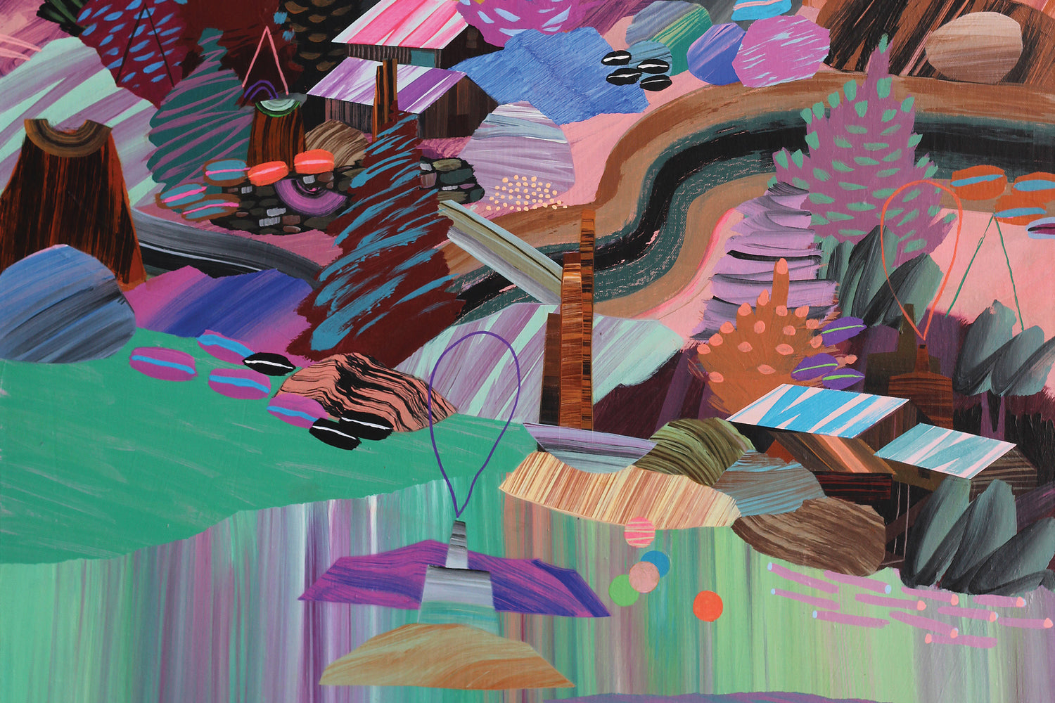
Bold colours, layered meanings, and unexpected materials—welcome to the world of Meghan Hildebrand. In this video, Meghan takes us inside her intuitive painting process, where painter’s tape becomes a tool for building structure and vibrant clashes of colour tell layered stories.
Known for her abstract, narrative-driven art, Meghan shares how she balances chaos and control through masking techniques, line work, and a fearless approach to composition.
Watch the video, and read on to find our Q&A with Meghan Hildebrand.
Artist Q&A with Meghan Hildebrand
Your work is deeply inspired by nature. Can you describe how your surroundings influence your artistic process?
I’m trying to do more than just depict my surroundings, I’m really trying to express how it feels, smells, sounds. I’m trying to capture the sensation, like being in the woods, where there is so much happening around you, yet it all works.
It’s that “making harmony out of the chaos” process — it gives me a sense of satisfaction, I think organizing disarray is a pretty universal human urge.
How do you translate the emotions and atmosphere of nature into your artwork?
I’m using a maximalist approach, filling the surface with details to get pulled into to create that all encompassing feeling of being outdoors in nature.
I work with colours pulled directly from nature, sometimes in combination with their direct compliment to set them off. There is a moody misty quality to west coast winters, and I like to use atmospheric perspective to create that sock in feeling.
Are there particular natural elements—landscapes, plants, wildlife, seasons—that you feel most drawn to, and why?
I love the visual possibilities of coastline - the myriad of ways to express it. Still water creates a mirror. Moving water refracts colour in exciting shapes.
Almost anything goes - much like clouds! Clouds offer an experience to be so expressive with paint.
I really enjoy painting trees too. A forest full of shapes offers so much to explore in terms of brushwork and subtle colour variations.


Do you have a signature colour palette? What are the must-have pigments or materials you always use to bring nature to life in your work?
I don’t have a signature palette! I tend to go through colour phases.
I use a lot of white, I probably go through 5 times more white than any other colour. It is a powerful tool! It can both calm colours down and bring them to life.
I’ve been bringing more glazing into my work, as a way to show the texture of brushstrokes. I use lots of matte medium for this.
What are your go-to paints, brushes, and surfaces when creating? Why do you choose these over others?
I will splurge on GOLDEN or Liquitex for the high end pigments.
I always stretch my own canvases from the heaviest canvas I can get and always gallery depths stretchers. The quality just shows when it’s done by hand with unprimed canvas. I enjoy that part of the process and I find I can do the best job of getting it drum tight.
I love Liquitex gesso, it can be applied really thick for a smooth surface, I don’t always like dealing with the texture of canvas.
I have dozens of brushes and I’m not picky, I just like to have enough that I can paint all day without having to wash them!
PLUS:
- a selection of palette knives
- masking tape
- acrylic medium for sealing tape and thinning paint
- a sta-wet palette so you can come back to your paints the next day
- lots of acrylic colours to experiment with
Are there any lesser-known tools or materials you swear by that other artists might find useful?
I love a matte medium.
Regardless of your taste from matte to gloss, I think it’s really important to unify the surface of the painting. Different levels of gloss, especially when combining different paint brands on one painting can look really distracting and sloppy.
I choose matte because you can hang it anywhere and not worry about glare ruining your enjoyment of the art.
Using matte medium after applying masking tape is a great trick to avoid seepage.
Matte medium can also thin colours and make glazes - water works to a certain extent, but water quickly breaks down the strength of the dried paint
Can you walk us through your layering process? How do you build depth and vibrancy in your work?
I start with a good amount of gesso for a smooth surface. The last couple coats of gesso will be tinted, so I'm not starting with plain white.
Then, I choose and mix the colours I plan to use. Then getting something on the canvas quickly, something energetic and new. After that’s dry, I will start drawing with chalk to plan a composition. Then with an assortment of brushes and masking I’ll start building it up.
It’s important to take breaks, put the painting aside overnight, come to it with fresh eyes and decide what to keep and what to negate.
Although I love the look of oil painting, I like acrylic because of the way I’m able to build up on it without waiting too long.
How do you use colour mixing to achieve realistic or stylized natural hues? Are there any unexpected pigment combinations you love?
I often use the technique of darkening or toning down a colour by using its direct compliment.
There is such an exciting range of mood and colour just in the green range, from turquoise to moss.
If you had to recommend three essential colours or materials to another artist exploring nature-inspired work, what would they be and why?
Hookers Green can take you from the darkest greens to lovely warm greens when mixed with cadmium yellow and red.
Ultramarine Blue has a great range too and leans towards violet, which does a lovely job of setting off those warm greens.
I would round that out with a nice copper brown like a Burnt Sienna.
And of course, you need white too!

How has your relationship with colour and materials evolved over time? Have you experimented with different mediums or brands?
I’m always learning more about colour, it’s a never-ending journey. There are always new combinations to discover. My understanding and appreciation for neutrals has grown. A good grey or beige can be really beautiful and is a great supporter of stronger hues.
I used the same acrylic paints since art school and am only now experimenting with brands. I’m making time for colours that I don’t “like” to keep pushing myself. Lime green for example. I don’t like it by itself, but it can be amazing in relation to other colours.
Do you have a specific product you couldn’t live without? What makes it stand out?
I always use a high quality gesso. You need a good foundation. You have to trust that it won’t crack.
What’s a common mistake artists make when trying to capture nature, and how can they improve?
I think it’s easy to get caught up in the details and end up making a fussy painting. Of course there are exceptions!
But for example, a simple application of the right shade of green can tell you it’s grass without painting every blade.
I suggest using a mix of brush sizes, big brushes for the sky or for big areas and small brushes for the details you want to include.
I always recommend a limited palette. The use of atmospheric perspective, like using less contrast or lighter colours in the background can help create the idea of space and being outdoors. You have to believe your eyes, not your preconceptions of how things should look.


Any advice for artists looking to explore new techniques or expand their materials?
Get a whole bunch of canvases or pieces of paper to explore with. It’s too easy to get frustrated when you just have one precious surface.
Are there any materials or tools you’re excited to experiment with in the future?
I’m interested in going further with watercolours. I’m aware that acrylics are plastics and some of it ends up going down the drain, adding to pollution.
Watercolours are more compact, easier on your brushes, and are so versatile.
I hope to keep evolving – it is essential to making art I'm excited about.

Meghan Hildebrand
With dreamlike explorations of real and imagined places, Meghan Hildebrand's paintings invite the viewer to get lost in worlds with few boundaries and to place themselves in open-ended narratives. Colours and forms are built up intuitively through experimentation and spontaneous mark-making, lending raw energy to the paintings.
Visit Meghan's website here: meghanhildebrand.com