
We’ve all seen Iridescent and Interference effects when viewing soap bubbles, oil slicks, flower petals, bird feathers, and more. They are fairly common in the natural world. If they are somewhat less common in artwork, it might simply be that they still represent new and unexplored possibilities for most people, even after being part of the artists’ palette for many decades at this point. What follows are some suggestions that can hopefully open up avenues of creativity and expression for those coming to these pigments for the first time, or even for those already somewhat familiar with them but looking for novel and unique applications.
As with any new technique, some experimentation and playing might be needed when learning how to use iridescent and interference paints, as they do not behave like regular pigments with mixing and in general use. In this article, I’ll outline some of the basic information you will need to know to begin working with them.
Helpful Hints about Interference Colors
The initial important and helpful things to know about most of the Interference colors are:
- They are very translucent and reach their maximum intensity when fully dry.
- The color effect is angle dependent. At very oblique angles over a white or pale valued color, the compliment of the main interference color can be seen. So, for instance, Interference Red can also appear greenish, Interference Orange, bluish, and Interference Green, reddish. This “flip” cannot be seen when the Interference colors are over a dark valued color, such as black, or if blended with dark valued colors.
- The strongest color effect is with a thin application over a dark valued color, such as black.
- They can be mixed and blended with other colors.
- When blending with very light valued and opaque colors such as Titanium White, keep additions very small. Adding too much will cause the pigments to all but disappear and the interference effect will be blocked.
- Mixing with darker valued pigments will make an infinite variety of more intense iridescent colors that can also become opaque, yet maintain a strong iridescence.
- You can blend them with any translucent acrylic medium to create translucent iridescent/interference glazes.
Mixing with Iridescent and Interference Colors
While Iridescent and Interference colors can certainly be used by themselves to create many different effects, the colors and textural effects are multiplied many times over once you start blending in various Mediums, Gels , and acrylic paint colors. While you can blend them with just about any regular paint color, you will find that lighter valued and more opaque pigments such as oxides and cadmiums, will require a bigger addition of Iridescent color to create the same intensity you could get with a more translucent color family such as Quinacridones or Phthalos.
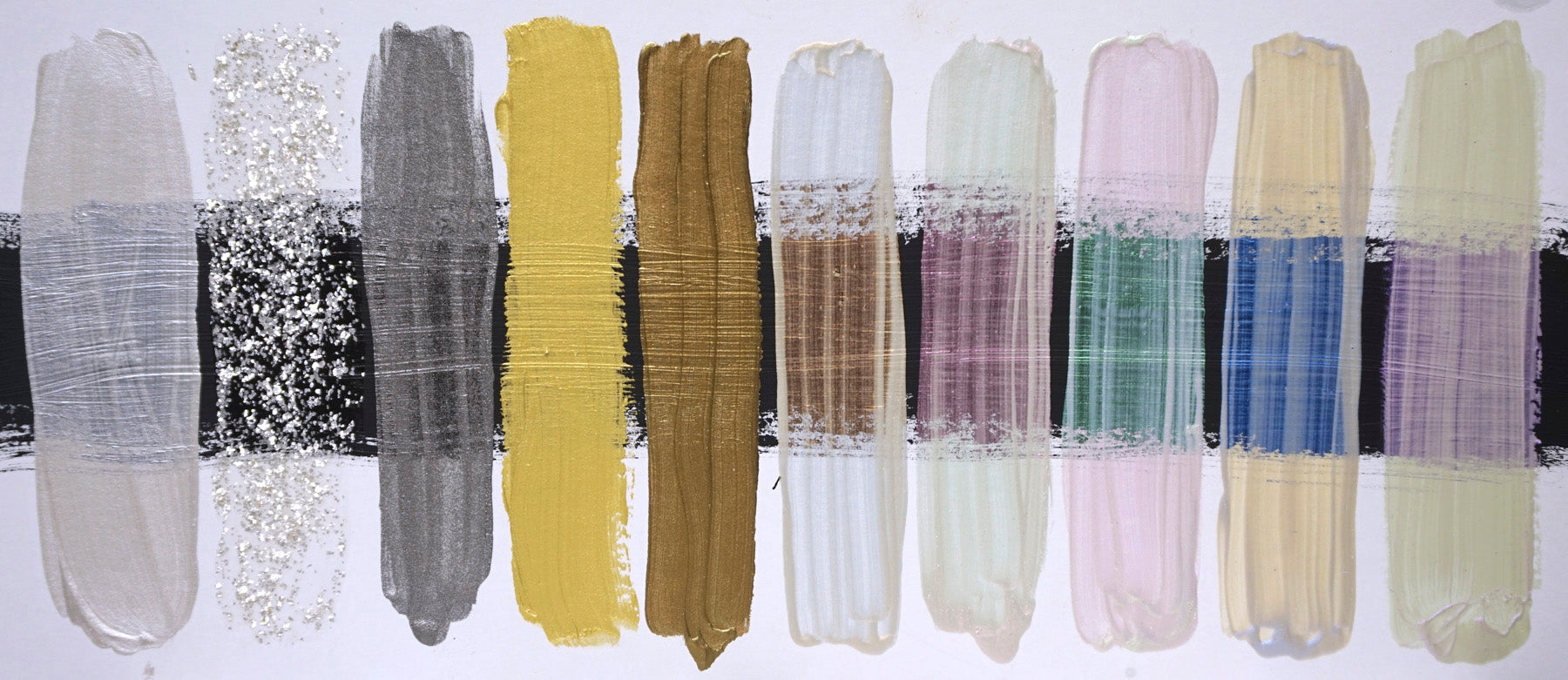
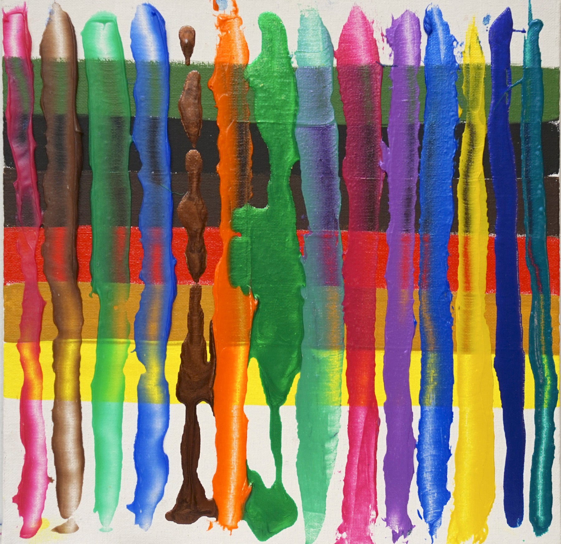
A selection of Iridescent and Interference colors on a white board with a center area of Black Gesso. Colors from left to right: Iridescent Pearl(Fine), Pearl Mica Flake(Small), Stainless Steel(Fine), Iridescent Gold (Fine), Iridescent Bronze(Fine), Interference Orange, Interference Red, Interference Green, Interference Blue, Interference Violet.
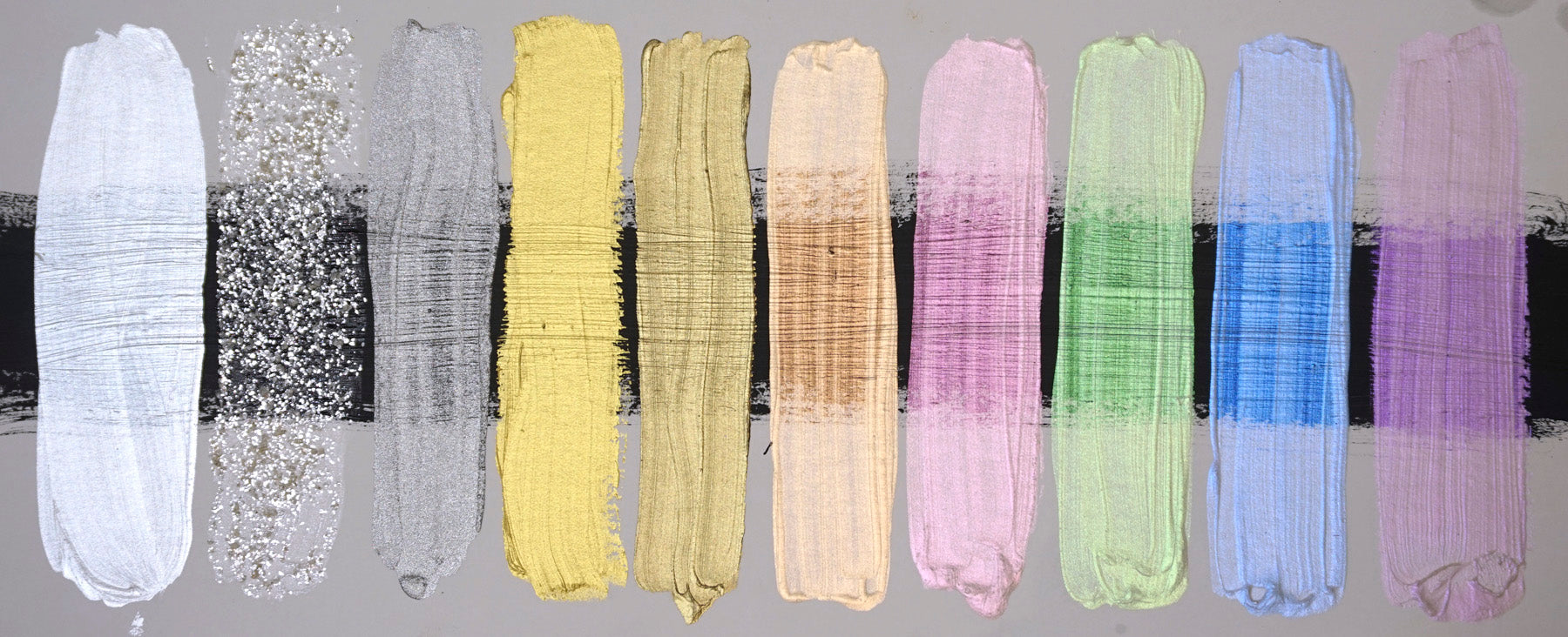
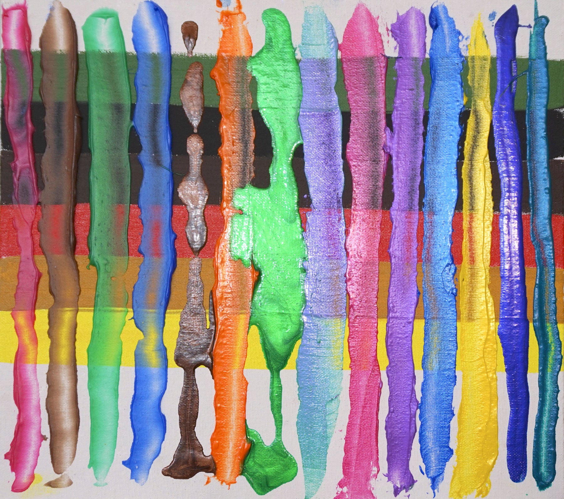
Here is the same sample board with a different light angle showing the full interference and iridescent effects.
Here is the same sample board with a different light angle showing the full interference and iridescent effects.
You can see that Iridescent Pearl creates the brightest reflectance. This is because it is reflecting all the visible wavelengths of light, showing a bright white metallic like effect. The Interference colors reflect just a small portion of the wavelengths, showing singular colors at a certain angle, and a complimentary color over white. Iridescent Pearl is very useful in creating a huge range of iridescent colors simply by blending with any of our regular acrylic paint colors, other than whites or pale gray like colors, which tend to block the iridescent effect.
All Iridescent colors will tend to lighten regular paint colors in mixtures, with Iridescent Pearl having the maximum effect in this regard. This can be used as an alternative method of tinting a color, where you also create a very different surface effect.
Mixing with the Interference colors is a bit different. If you blend an Interference color like Interference Violet with a similar hued color like Dioxazine Purple or Quinacridone Violet, then you will accentuate and heighten the “violet-ness” of those colors. It is possible to create very intense colors that can have an almost Fluorescent like effect but without the fugitive nature of Fluorescent pigments.
Mixing Opposites
You can also mix opposites such as Interference Violet with a Green or Yellow color like Permanent Green Light, Phthalo Greens or Hansa Yellows. Yellow, as a hue range, is typically very light in value so will tend to hold back the Interference effect to some degree; you’ll have to add more to get a more pronounced effect. This is similar with any lighter valued and more opaque color. Traditional color mixing sense tells us that when you combine complimentary or near complimentary colors, they cancel out and make browns and grays. This is true for regular pigments but not so with Interference pigments. It seems counter-intuitive, but you can have complimentary colors in the same paint film. This does not work if you blend several Interference colors, only one Interference color with a regular color or blend of regular colors. It is hard to imagine until you see it. It is also hard to photograph, as the effects are angle dependent, so I have included several angles of each sample in the photos.
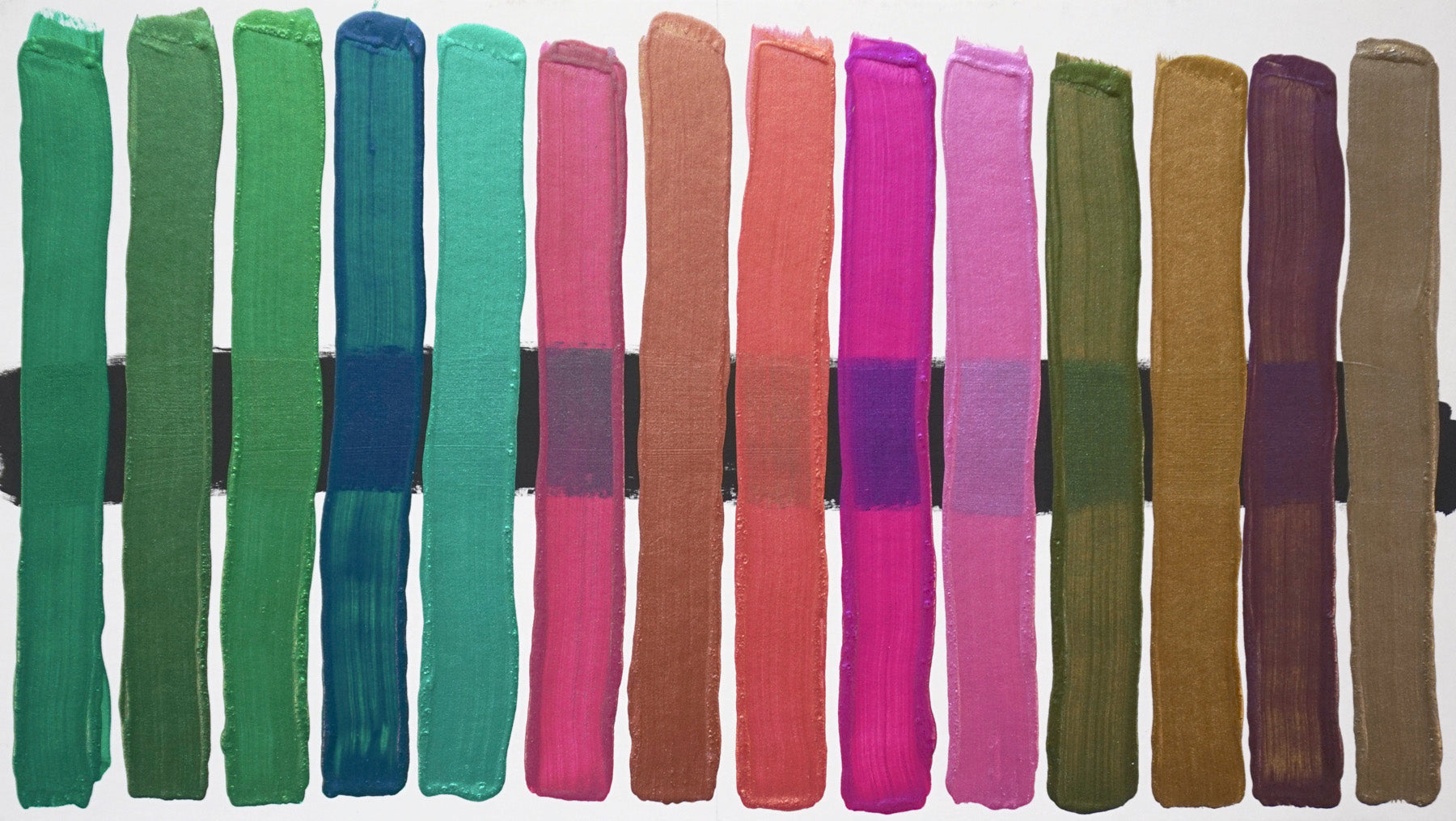
From left to right, 1:1 mixtures of Phthalo Green (blue shade), Quinacridone Magenta and Van Dyke Brown with Interference Green, Iridescent Bronze(Fine), Iridescent Gold(Fine), Interference Violet and Iridescent Pearl(Fine). I left out the Iridescent Gold (Fine) with the Van Dyke Brown mixtures.
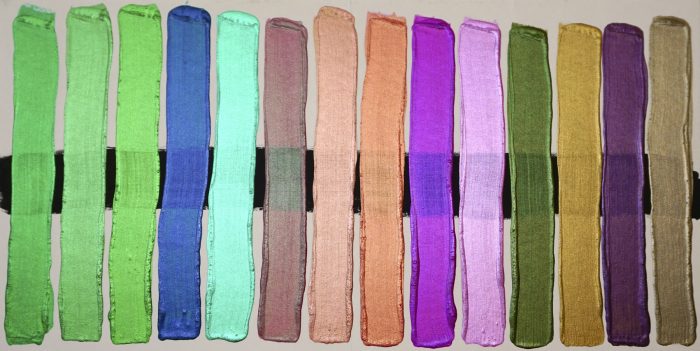
Here is the same sample board with a different light angle showing the full interference and iridescent effects.
Ratio of Color to Acrylic Gel or Medium
The next variable to play with is the ratio of acrylic binder to pigment. This is done by adding in various acrylic Mediums and Gel Mediums. A little bit of Iridescent pigment can go a long way, and extending with Mediums is a key part of learning how to get the most out of them. Additions of Mediums will help you modulate the level of iridescence to just where you want it for your particular use, and to assist in beautiful layering effects via more translucency.
As more medium is blended in to the more concentrated Iridescent color blend, the translucency and subtlety of the iridescence increases as well. Matte and Semi-Gloss Mediums and Gels will have a very beautiful, softer iridescent effect, while Gloss Mediums and Gels will be more pronounced and more translucent. More opaque mediums such as our Pumice Gels will yield very interesting results due to the rough surface texture that scatters the light.
Layering with Iridescent and Interference Colors
While you can use our Iridescent colors right from the tube or container for layering, you will find a wider range of possibilities by using them blended with various Mediums and Gel Mediums which allows for more control over the translucency of the films. While there is no limit to the number of layers you can use, at a certain point the effects may become muddled. There is something to be said for simplicity, and one Iridescent glaze spread out on a surface with a planned range of values and colors underneath can yield intense and wonderful color effects with one stroke.
A selection of mixtures of several Golden Mediums and Gel Mediums with various amounts of Fluid Acrylic colors and Iridescent/Interference colors, over different colors.
Here is the same sample board with a different light angle showing the full interference and iridescent effects.
Using water and thinly formulated mediums to make washes and thin, pourable mixtures can create a different range of effects that are less easily controlled. Pourable mixtures with Iridescent colors will create interesting flow and tide lines that can have great appeal, but you must be ready for the surprises that come with watermedia and more fluid approaches.
Keep in mind that the layered effects will be greatly influenced by the color and value of what is underneath your Iridescent glazes. Darker values will always yield more intensity, unless your mixture is opaque.
Here you can see the difference in color and iridescence between the wet and dry mixture of GAC 800, Fluid Acrylic Phthalo Greeen ( Blue Shade ) and Interference Green.
With some testing, playing and experimenting you will find that adding Iridescent and Interference colors to your palette will allow for very new and unique color possibilities, with a range that spans the look of a rich and glowing automotive finish, to a subtle wax like iridescence. Embrace the spectrum, shake up your world, and have fun doing it!
Here are various mixtures of Golden Mediums, Gel Mediums, Coarse Pumice Gel combined with Interference colors and Fluid Acrylics over some calligraphic marks made with Golden Black Gesso.
Thank you to our friends at GOLDEN for this great article!