The Beauty of Greens: Why Mixing Your Own is Worth the Brushstrokes
When painting landscapes, whether on a sun-dappled hiking trail or from a cozy urban sketching perch, artists often face the same challenge—how to create greens that feel alive. While it might be tempting to reach for pre-mixed green pigments straight from the tube, there is a world of nuance, depth, and harmony to be discovered when you mix your own greens. For watercolourists especially, this practice offers a richer, more organic painting experience—one that better captures the complex beauty of the natural world.
With the addition of 12 new colours in the Opus Essential Watercolours range arriving at the beginning of watercolour season, we are excited to share the experiments in mixing greens as we explore the range of green colours we can make with our new and existing colours.

A Harmonious Palette of Greens from Simple Ingredients
Mixing your greens from primary colours, typically a blue and a yellow, not only expands your palette but also gives your work a sense of cohesion. When you rely on a single yellow and blue as your foundation, you can create a wide spectrum of greens simply by adjusting the ratio—cool, piney greens for wintery shadows, warm, sunlit greens for spring buds, and muted, olive tones for the faded foliage of fall. Because they originate from the same colour family, these greens naturally harmonize on the page, avoiding the jarring effect that sometimes results from using a range of unrelated tube greens.


The Magic of Watercolour Blooms
One of the most magical aspects of watercolour is its spontaneity, and mixing your greens enhances this quality tenfold. When a transparent yellow washes into a granulating blue, you don’t just get green—you get movement. You get blooming edges, subtle texture, and soft transitions that echo the variability of real leaves, grasses, and moss. These “blooms” can be especially expressive in plein air work, where the changing light and breeze invite a looser, more responsive painting style.


Texture and Depth Through Granulation
Granulating pigments, such as Cobalt Blue or Ultramarine, add further richness to your greens. As they settle into the paper's texture, these pigments create a mottled, naturalistic effect that mimics the uneven surfaces of foliage and earth. Combined with a bright yellow like New Gamboge or a more subdued Raw Sienna, they form greens that shimmer with dimension—perfect for depicting the layered complexity of a forest or a shadowed parkway.


Adapting to the Seasons with Colour Temperature
Seasonal shifts in colour temperature are also more faithfully captured when you mix your own greens. In early spring, cooler mixtures with more blue can suggest new growth and early morning light. As summer unfolds, you might shift toward yellower mixes to reflect the sun’s warmth. In autumn, adding a touch of red or burnt sienna can transition your greens into the earthy, ochre tones of turning leaves. This adaptability helps your paintings resonate with the mood of the moment, grounding your work in time and place.

Mixing Greens as Mindful Observation
Ultimately, mixing your own greens is about more than just colour—it’s about connection. It invites you to slow down, observe more closely, and respond intuitively to the world around you. Each blend becomes a personal interpretation of nature, a reflection of both your surroundings and your hand. So next time you're painting outside or filling the pages of your sketchbook, try leaving the tube green behind. With a few well-chosen yellows and blues, you might just find your greens becoming as alive as the scenes they depict.
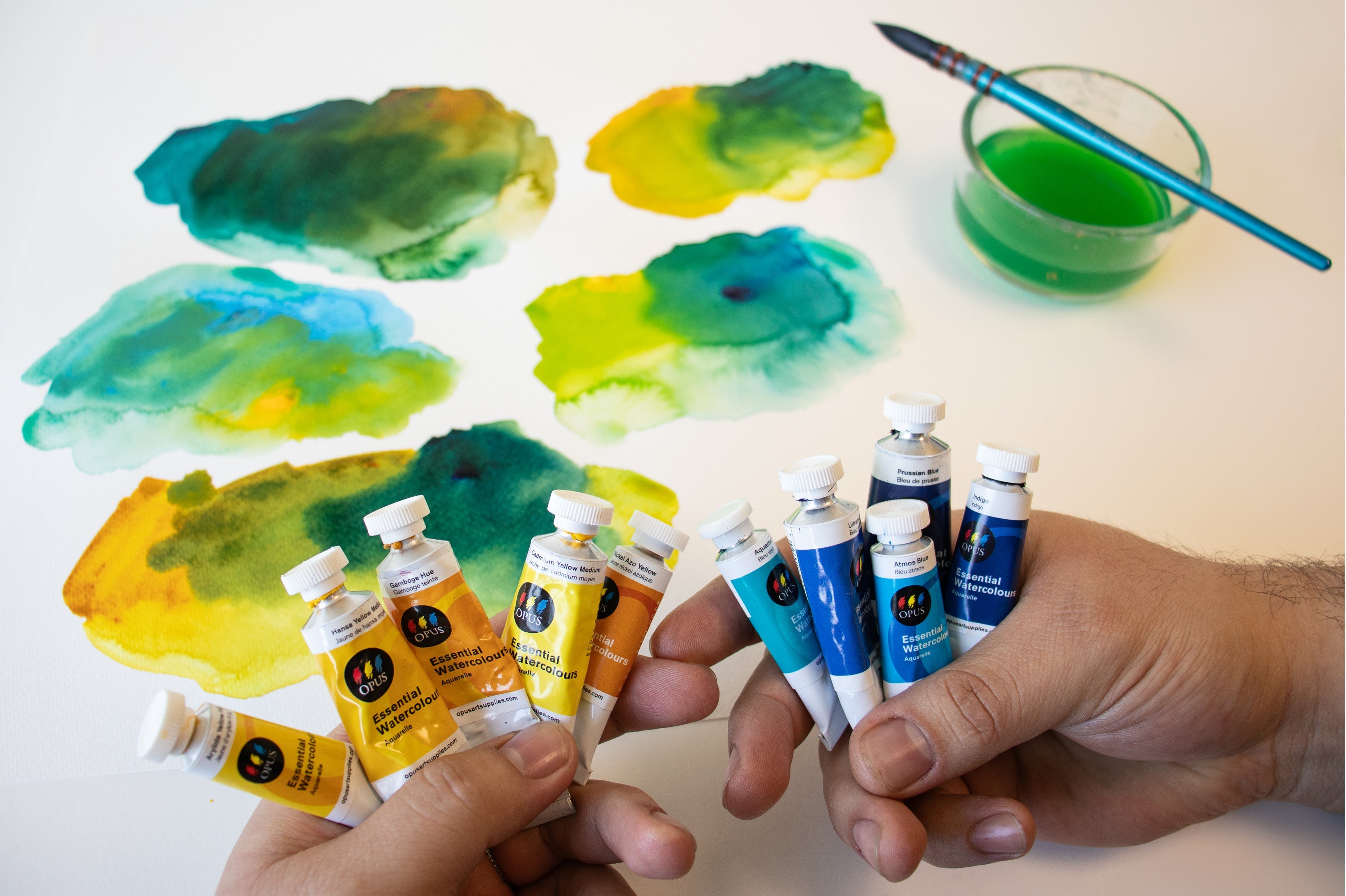
Explore The Watercolours & Tools We Used:
When we experimented with mixing the greens, we used the following colours from the Opus Essential Watercolours line.
For the yellows, we tested out our new yellows, including:
- Nickel Azo Yellow
- Aureolin Mix
- Arylide Yellow
- Mixing Gold (which admittedly does lean more towards an orange colour)
...along with some staple yellows including:
- Cadmium Yellow Medium
- Hansa Yellow Medium
- Gamboge Hue
For the blues, we experimented with two of our new blues:
- Atmos
- Aquamarine
...along with some favourite classic blues like
- Ultramarine Blue
- Phthalo Blue
- Cobalt Blue
- Prussian Blue
- Indigo
We used an Opus Galiano Quill brush in a size 4, as they hold loads of water, which allows the paint to flow from the brush nicely - especially when you're looking for blooms, granulation, and surprises, and because we were experimenting, we opted to do our testing on Opus Student Watercolour paper in the 11"x 15" size.