In our theme "Colour Expression," we're exploring colour as a powerful tool for self-discovery and emotional connection.
This month, we explore how artists use colour to convey meaning, create impact, and spark connection.
Through thoughtful explorations, events, and hands-on activities, we’ll dive into the nuances of colour theory, the interplay of light and shadow, and techniques that bring colour to life.
Let’s celebrate the transformative power of colour—its ability to uplift, inspire, and bring us together.
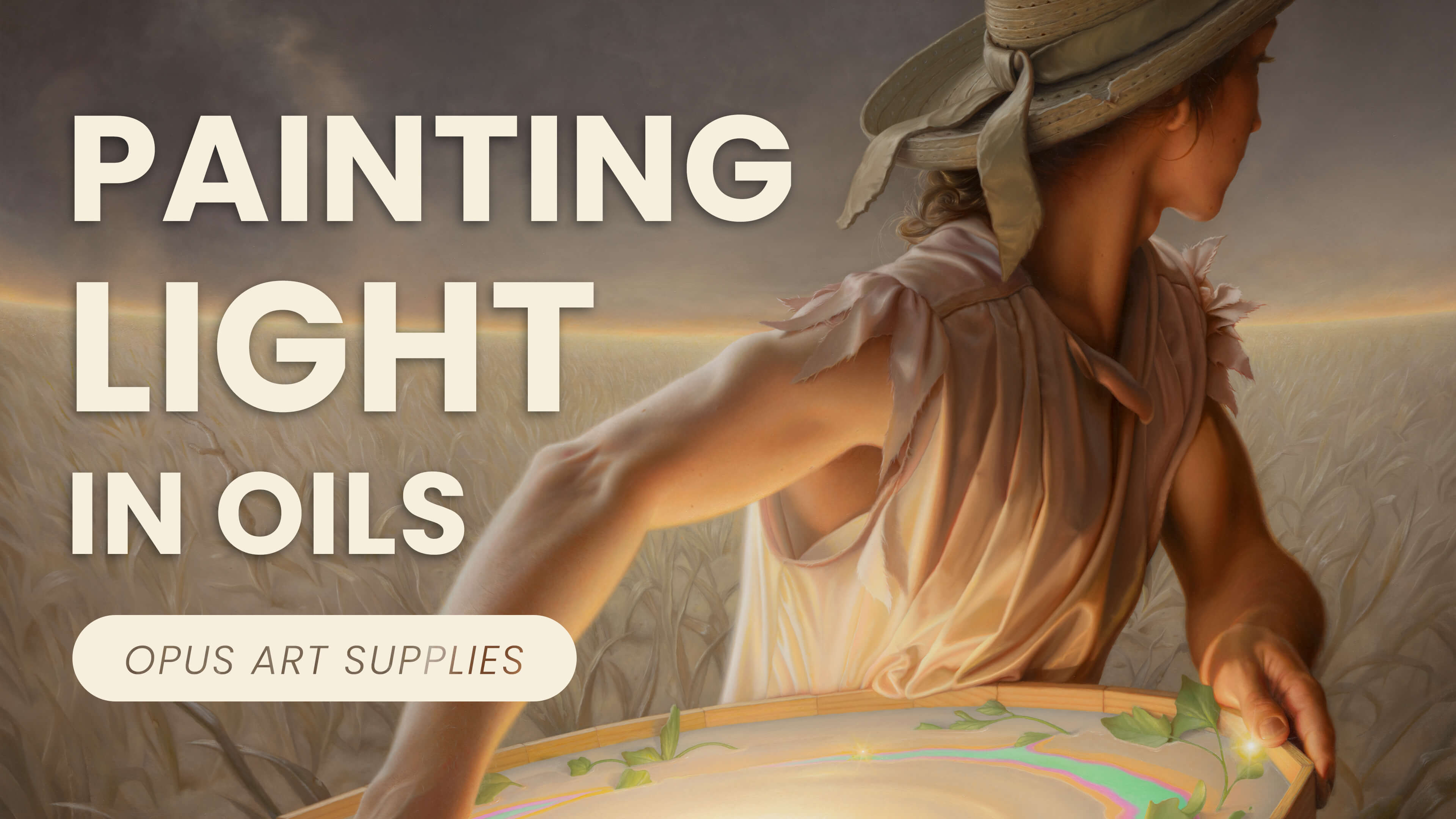
Steve Chmilar On Light & Colour
Professional artist Steve Chmilar expertly balances light and colour to create otherworldly, dream-like paintings – though you may be surprised to learn his thorough creative process also involves three-dimensional work too!
Watch the video, and read on to find our Q&A with Steve Chmilar.
Steve Chmilar's Surrealist Guide to Depth & Drama
Artist Q&A with Steve Chmilar
Your work often plays with unexpected colour relationships. How do you decide on your colour palettes, and do you ever deliberately break traditional colour theory rules to create tension or surprise?
The perception of unexpected colours within my paintings is relative to every colour that is expected within my paintings.
Those expected colours come from a natural palette, similar to a palette that many traditional realists might use, with the infrequent addition of an unexpected colour like a light, bright saturated turquoise. I have always been influenced by the Romantic era and Tonalist painters who choose a warm light scheme.


Your use of light and shadow creates a surreal atmosphere; how do you balance warm and cool tones to evoke emotion?
My surreal atmosphere comes from a combination of my strict adherence to how light makes things look three-dimensional, and subject matter. Both can be combined in an infinite number of ways. My understanding of local colour and light colour came from diligent experimentation with lighting dioramas and live models for over a decade.
I have learned that the relationship between warm and cool is a critical balance where one enhances or detracts from the other. It is as important as dark and light, or like in music; low and high frequencies.
Being that I generally choose warm light as the dominant light source, I simply keep that in mind while painting any plane, atmosphere or object within a scene. If the dominant emotion is evoked from the warm light, then it will usually affect each local colour in the entire composition.
For example, making what might appear to be a neutral grey in an overcast daylight painting, appear as a warm grey, leaning toward orange, pink, or salmon.
Are there any particular pigments or colour mixes you rely on to create a sense of glowing light or atmospheric depth?
These mixes can be achieved in many ways, especially if an artist has a large paint collection.
However, I do like some less common pigments from time to time to make mixing quicker. I have used Nickel Yellow from Williamsburg as well as their Naples Yellow Reddish to achieve a desirable warm light colour directly from the tube.
Do you alter your choice of materials when painting different types of light - natural sunlight, artificial glow, moonlight, or candlelight?
That depends on whether it is my underpainting or final colour layer.
In my first layers, I do not add medium and I use only faster drying pigments to approximate what the painting will look like in my final colour layer.
These faster drying pigments often include:
- Cobalt Yellow
- Ochre
- Prussian Blue
- Siennas
- Transparent Oxides
- Umbers
- Mars Red
- Mars Black
For the final colour layer my possibilities are usually more varied, including some of the slower drying pigments I already mentioned but with added Stand Oil Medium.
In the final colour layer I use everything from Cadmium Yellows, Cadmium Reds, Turquoise to Alizarin and beyond.
You work with oils, coloured pencils, and even sculptural elements (in your reference models). How do those different mediums influence your approach to storytelling?
Coloured pencil can be very quick for an experimental sketch. I used to spend a lot of time on fully realized coloured pencil drawings but tend to use them more sparingly now.
Sculptures help me to actualize how light will appear on that three-dimensional form. I’ve learned over time to honour the limitations of some sculpture materials such as clay, wood, acrylic paint and cotton and represent that material as it is rather than trying to make that material represent something in the real world.
For example, I had used a few nail heads in the wooden structure in my painting The Adult Table. At first I wanted to change the scale-size appearance of the small finishing nails I actually used in my model, but then I realized that I could use their large appearance (relative to the size of the human figures) to give the scene an other-worldly effect.
Oil paint to me has such a legendary, majestic, time-honoured appearance that is unmatched in my eyes to finish my most time-consuming pieces - that which represents my oeuvre. Over the years, I have developed a close relationship with each pigment to know exactly what I might use to mix something before I begin.

Do you find that switching between materials - like from oils to colored pencils - gives you new insights into how you use light and shadow?
Yes, absolutely. I believe that all mediums can make us feel differently as we are working and give us new approaches.
Like in music, certain instruments just seem to have songs stuck inside them and they get unlocked as soon as they are played. Because of the qualities of mediums like Coloured Pencil, I have found that to be one of my first introductions to Optical Mixing; an important concept to utilize.
By layering multiple colours with coloured pencil to make the illusion of another colour, it made me see how hints of each separate colour still remained and were visible up close, while the same overall colour can appear uniform from a distance.
This is often not as quick to achieve with oil which can appear as a solid flat colour very easily.
How do you make sure your highlights feel luminous rather than chalky or overworked, especially in oil painting?
This is a great question and very important for art students to understand.
A keen decisive sense of what is happening in each ‘zone of value’ is the key to this I believe. When something appears ‘chalky’ it means that the area is cooler than it should be relative to the rest of the image. It appears chalky when the coolness from a lighter pigment is spread on top of a darker surface, literally the same as how chalk appears on a blackboard. The key to fixing this is to adjust the colour temperature of the area by adding warmth (usually yellows and reds).
Next, it is fundamentally important to know that when representing a warm light source, there is an order to the ‘zones of value’ that almost always occurs in some way. In order from light to dark, that is something like: warm white, yellow, orange, red, and then the red often blends into the background. Those colours must correspond to the value scale, something like 10, 8, 6, 4 etc.
Another great example (and why it is commonly said not to use black in mixing) is when making a proper value scale in a colour like orange. If we start somewhere in the middle of the value scale at 5 with a saturated orange, we must add the right amount of yellow into the mix as it approaches the higher values (towards 10). White alone will make it look too cold and therefore chalky, especially if the cool white is dry brushed over a warmer colour. When darkening an orange, we want to go toward something like a burnt umber instead or black.
What qualities do you look for in your brushes and tools, and have you found any Opus supplies that have become studio staples for you?
I always hope to use the best quality materials that I can so that these tools increase the strength of my artistic vision rather than detract from it.
I have many multi-packs of the Opus Bravura brushes which are a staple for me when finishing most of the final colour layers in my paintings. My most common sizes are 0, 2 and 4. I have also enjoyed the Opus Denman and Legato series brushes .
If you could experiment with any new material that you haven't tried yet, what would it be and why?
I have always been an avid drawer and would always love to go further into the world of both graphite and charcoal.
I have also always been intrigued by Oil Pastels and would love to use them more someday. The only stumbling block with the oil pastels is that I would want to acquire an entire set (hundreds of colours) in order to use them in my desired way. Currently, I only have a limited supply of oil pastels.

Steve Chmilar
Steven was born in Grande Prairie Alberta where he spent most of his childhood on a farm, helping with chores, drawing, and building imaginary civilizations in the woods.
A career shift to full-time visual artist was made after the success of his first show in 2011. He lives in North Saanich, British Columbia, where he delightfully paints every day overlooking a salt water lagoon.
Visit his website: stevechmilar.com