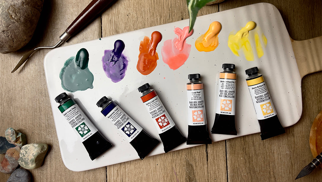
These six new watercolours didn’t come from a lab—they came from the road. During a recent global tour, Daniel Smith’s John Cogley met with watercolourists across Europe and Asia, from seasoned professionals to passionate newcomers. Their conversations—about palette gaps, mixing challenges, and the colours they dreamt of—sparked the development of this set. Some hues were born from a need to capture a specific effect; others were inspired by the landscapes and cityscapes of the regions he visited. The result is a thoughtful expansion of the Daniel Smith range, built not just on innovation, but on listening—proof of the brand’s commitment to serving artists by creating the colours they truly need.


Jaune Brilliant No 1
Jaune Brilliant No.1 is semi-transparent, non-staining, non-granulating, with excellent lightfastness. This light yellow is sunlight in a tube. Excellent for sky-scapes and floral/garden paintings. Perfect for finishing highlights and negative painting techniques. It is a great addition to any palette.
“Very delicate! It remains in place when applied wet-on-dry on all paper textures, a little less on hot press paper.
It is better when it is applied very lightly; not too thick. It has a nice effect for glazes and mixes with reds and other yellows for warm tones.”
-Giovanni Balzarani
DETAILS:
Pigment: PY 65, PW 6 | Series: 1
Lightfastness: Excellent
Transparency: Semi-Transparent
Staining: Non-Staining
Granulation: Non-Granulating

Jaune Brilliant No 2
Jaune Brilliant No. 2 is non-staining, non-granulating, and semi-transparent. This light peach colour leans toward orange. It is a creamsicle on a summer day. Makes a great sunrise or sunset sky-scape. Useful as a highlight colour, or in negative painting techniques. This colour is a joy to work with.
“Beautiful shade! Excellent for portraits and seascapes (sand-based) and to get nice mixes with earth tones.”
-Giovanni Balzarani
DETAILS:
Pigment: PO 62, PW 6 | Series: 1
Lightfastness: Excellent
Transparency: Semi-Transparent
Staining: Non-Staining
Granulation: Non-Granulating

Manganese Violet
Manganese Violet is a stunning single pigment violet that mixes beautifully with other colors. It is low staining and semi-transparent, allowing for vibrant mauve washes. The gorgeous granulating quality provides a bold tool for painting deep rich floral landscapes. You’ll be in excellent artist company—Manganese Violet was a staple on Claude Monet’s palette.
DETAILS:
Pigment: PV 16 | Series: 3
Lightfastness: Excellent
Transparency: Semi-Transparent
Staining: Low Staining
Granulation: Granulating

Earthy Light Red
Earthy Light Red is a single pigment, non-staining, granulating, semi-transparent color with excellent lightfastness. This color transports you to sunny red-rock environments. This light red has hints of orange and equips you to paint joyous florals. It belongs on every palette.
DETAILS:
Pigment: PR 290 | Series: 2
Lightfastness: Excellent
Transparency: Semi-Transparent
Staining: Low Staining
Granulation: Granulating

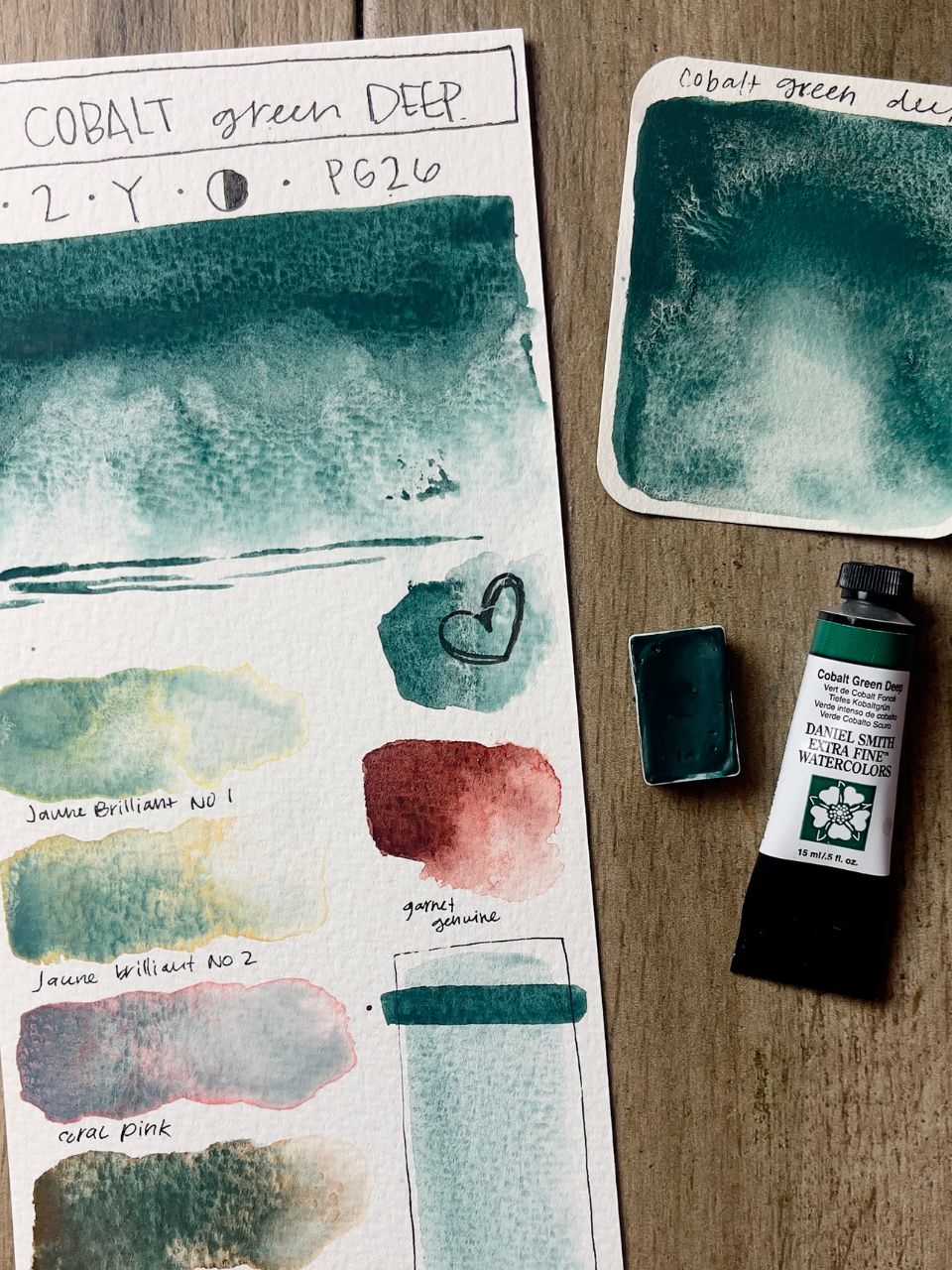
Cobalt Green Deep
Cobalt Green Deep is a semi-transparent, single pigment paint that lends itself to gorgeous deep woodland landscapes. It mixes effortlessly with other colors– try it with Neutral Tint, or Indigo for fascinating stormy sea and sky effects. Cobalt Green Deep’s granulating qualities will add depth and life to your paintings.
“Very interesting in the drafting; the right granulation. An interesting cold tone that may be used in various forest landscapes! Used with Neutral Tint or Indigo it can be a very interesting dark green.”
-Giovanni Balzarani
DETAILS:
Lightfastness: Excellent
Transparency: Semi-Transparent
Staining: Low-Staining
Granulation: Granulating
Coral Reef
Coral Reef is a light pink that is semi-transparent, non-staining, and has an excellent light-fast rating. This is such a happy color! Great for painting florals. This color brings to mind flamingos, shrimp, and shells. Pair it with Cobalt Teal Blue and it whispers of sun-kissed Caribbean adventures.
“Very covering even at 50% dilution. Excellent for the base of a slightly cartoonish face. Intense if used in mass tone!”
-Giovanni Balzarani
DETAILS:
Pigment: PO 73, PW 6 | Series: 1
Lightfastness: Excellent
Transparency: Semi-Transparent
Staining: Non-Staining
Granulation: Non-Granulating
